Depop
Refreshing outdated UI for better user engagement and a seamless, community-driven shopping experience.
Project Overview
Challenge
Depop gained traction among Gen-Z by imbuing their re-commerce platform with social media features and aesthetics, creating a marketplace that felt like you were shopping in your most fashionable friend’s closet. However, as social media interfaces have evolved, Depop’s once-trendy design now appears dated, affecting user engagement and experience. This case study examines ways to revitalize Depop’s UI, making it more intuitive, visually engaging, and better suited to today’s digital expectations while preserving its unique focus on the social connection between buyers and sellers. Overall, I aimed to create a fresher, more dynamic interface that aligns with current trends and user needs while highlighting features that create community.
Objective
- To redesign Depop’s user interface for improved engagement and a seamless, community-focused shopping experience.
Project Scope
Mobile app redesign
Tools
Figma
Role
UX Designer (Research, User Testing, Visual Design, Interaction Design)
Team
Self directed, with feedback from mentor and peers
Duration
12 weeks, 6 hours a week, 72 hours
Background
- Depop is a social e-commerce app that enables users to buy and sell items, focusing on used and vintage clothing.
- The user base is primarily women, with over 90% of users under the age of 26 (businessofapps.com).
- The app’s interface is modeled after Instagram, creating a social media-like experience where users can browse, engage with fashion content, and discover trends.

“Depop draws in Gen Z users through being easily accessible and having affordable prices, and much of its user base uses it to track trends in fashion. Popular sellers on the platform often go on to become social media influencers.”
Taylor Lorenz, The Atlantic
Problem Statement
Depop, a fashion reselling app that gained popularity in the mid to late 2010s with a Gen-Z audience, thrived by mimicking Instagram’s UI, creating a trendy, social atmosphere that felt like shopping in your most fashionable friend’s closet. However, as social media trends have evolved, Depop’s user interface now feels outdated, diminishing its appeal and user experience.


While Depop experienced a surge of active users in 2020 due to the COVID-19 pandemic, they lost most of these users in the following year. Additionally, compared to their close competitor Vinted, Depop is struggling to increase revenue. I believe a contributing factor to the app’s stagnation is their reliance on copying Instagram’s UI circa mid-2010s.
How might we update Depop’s user interface to align with current social media and shopping trends, enhancing its appeal for a Gen-Z audience?
App Audit
To better understand the strengths and weaknesses of Depop, I conducted an audit of the app’s interface, user experience, and overall functionality. The goal was to identify areas for improvement to enhance the app for its young, fashion-savvy audience. I found several issues:
Monotonous layout: Depop’s pages lack variety and breaks, creating a repetitive and outdated feel compared to modern apps like Instagram, which now include dynamic photo proportions and video reels.
Weak calls to action: The app provides minimal prompts to encourage purchases, reducing opportunities for user engagement, and making the app experience less exciting and fun to use.
Underwhelming micro-interactions: The animations for actions like “like” and “save” feel unpolished and fail to meet current social media and shopping app standards, making engagement less satisfying and impactful.
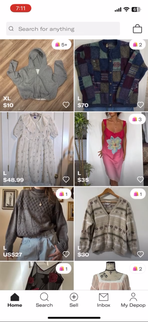
Depop’s home page features an infinite scrolling grid of listings, showing little hierarchy or sorting between items.
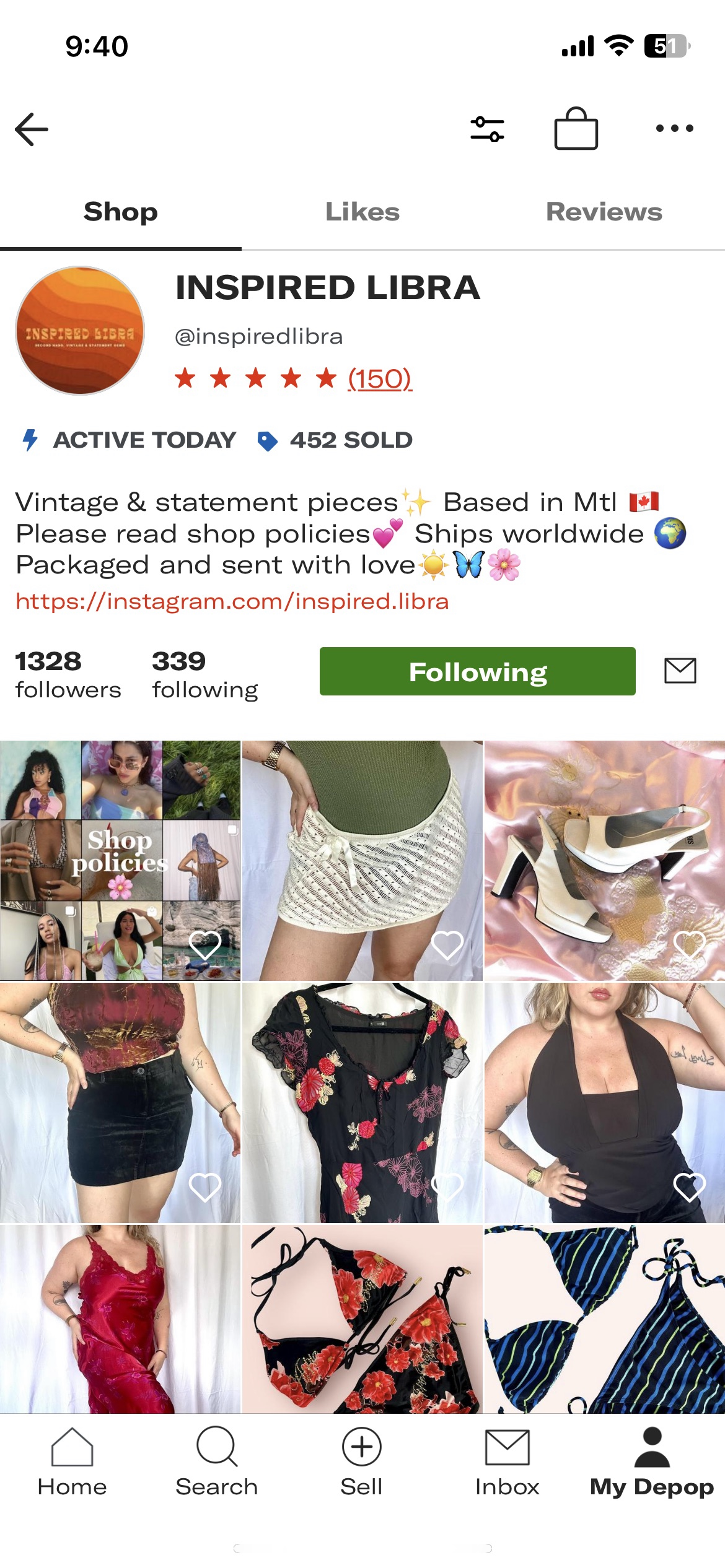
The seller profile does not include a section for shop policies for information like shipping, refunds, ect. leading sellers to put the information in a post at the top of the grid.
Key actions lack visibility: Actions like the follow button on profiles disappear when scrolling, making them harder for users to access.
No dedicated space for shop policies: Users must pin a listing for rules and policies, as there’s no designated area in their shop profile.
Through my audit, I found that Depop’s outdated, monotonous layout lacks engaging visuals, dynamic calls to action, modern microinteractions, and dedicated space for shop policies, making the app feel dated and less user-friendly.
User Feedback
After checking through the Depop subreddit, I found users had many complaints. They needed to see updates from the accounts they follow, have a more engaging home page, and have better search functionality.


Competitive Analysis

Thread Up
An online consignment store based in California where sellers can mail in used clothes, and the company will handle the selling process (photographing, pricing, listing, and shipping the piece) and give a portion of the profit to the seller.

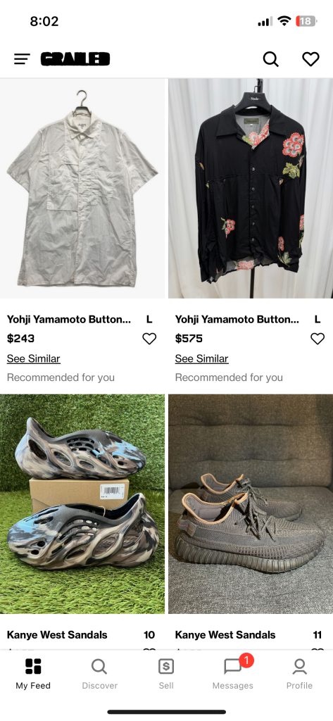
Grailed
A social e-commerce company specializing in letting users buy and sell menswear and streetwear.
Poshmark
A social e-commerce company based in California that allows users to buy and sell new and secondhand fashion, home goods, and electronics.


What Competitors Do Better
Enhanced page layouts: Competitors offer more varied and organized layouts, improving user navigation and engagement.
Stronger trust and security: Platforms prioritize safety features, fostering trust between buyers and sellers.
Optimized search functionality: Competitors better understand their audience’s needs, delivering more intuitive and relevant search experiences.
User Personas
To capture Depop’s audience, I created two personas: a buyer and a seller. These profiles highlight their goals and frustrations, which helped guide the design decisions I made to improve the product.
Buyer Persona

Mia Thompson
The Thrifty Trendsetter
Age: 23
Location: Chicago, Illinois
Occupation: Graphic Design Student
Mia is a fashion-forward Gen Z buyer who loves finding unique thrifted pieces to add personality to her wardrobe. She is budget-conscious and enjoys the thrill of negotiating deals. She regularly browses social media for inspiration, following influencers and online communities to stay on top of trends.
Goals
- Find affordable, high-quality items that match her personal style.
- Negotiate prices or bundle items to save money.
- Support sustainable fashion by shopping secondhand.
Frustrations
- Difficulty navigating outdated or cluttered interfaces.
- Lack of detailed seller information or trust indicators.
- Can’t see new items from followed sellers easily, so misses out on desired items
Seller Persona

Jessie Harper
The Stylish Side Hustler
Age: 34
Location: Los Angelos, California
Occupation: Freelance Stylist
Jessie is a millennial seller who uses Depop as a side hustle and to declutter her closet. She loves fashion and curates her shop with a specific aesthetic in mind. Jessie values quick, easy communication with buyers and an easy way to list and manage her inventory. She needs her shop to feel professional and trustworthy to attract buyers.
Goals
- Sell items quickly while maintaining a good reputation.
- Be discovered by buyers.
- Build trust and rapport with buyers to encourage repeat purchases.
Frustrations
- Difficult for buyers to find her items in search.
- Lack of flexibility to easily set policies or communicate discounts.
- Challenges with negotiating prices or shipping effectively.
Mia and Jessie’s profiles illustrate the needs of Depop’s buyers and sellers. Addressing their goals and frustrations—like ease of navigation for buyers and better shop management for sellers—can improve the platform and strengthen user connections.
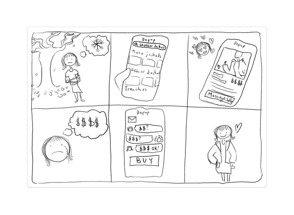
Storyboard
To illustrate how a user might interact with the Depop experience, I created a storyboard that follows a typical buyer’s journey. In this case, a woman is cold, looks for a jacket on Depop, finds one she likes but it’s too expensive, so she negotiates with the seller and is able to receive the jacket. This exercise helped me form what would become the task flow.
User Task and Flows
To showcase the new UI changes, I focused on a common user task: searching for a large black leather jacket, negotiating a discount with the seller, and completing the purchase. I began by mapping out a task flow to outline the process, then expanded it into a detailed user flow to capture every step and decision the user might take to complete the task.


Mapping the user flow revealed multiple potential paths to complete the task, such as selecting an item from the home page, filtering search results, or messaging the seller from either the product page or the cart. Moving forward, I ensured all these paths were intuitive and functional to accommodate different user behaviours.
Low Fidelity Prototype
To quickly visualize design ideas and gather user feedback, I created a low-fidelity prototype using a paper wireframing kit in Figma. This approach allowed me to rapidly iterate on key screens and test usability early in the process, without worrying about details of the visual design just yet.
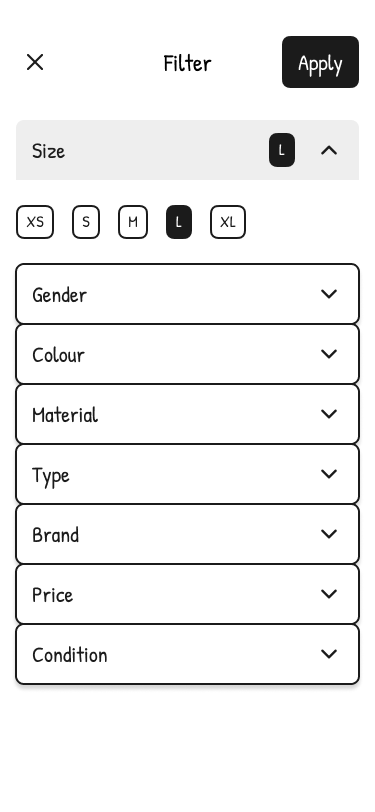
I redesigned the filtering menu using an accordion format and added chips to show selected filters clearly. This improves on the old menu, where it was hard to tell which filters were already applied.
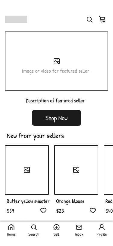
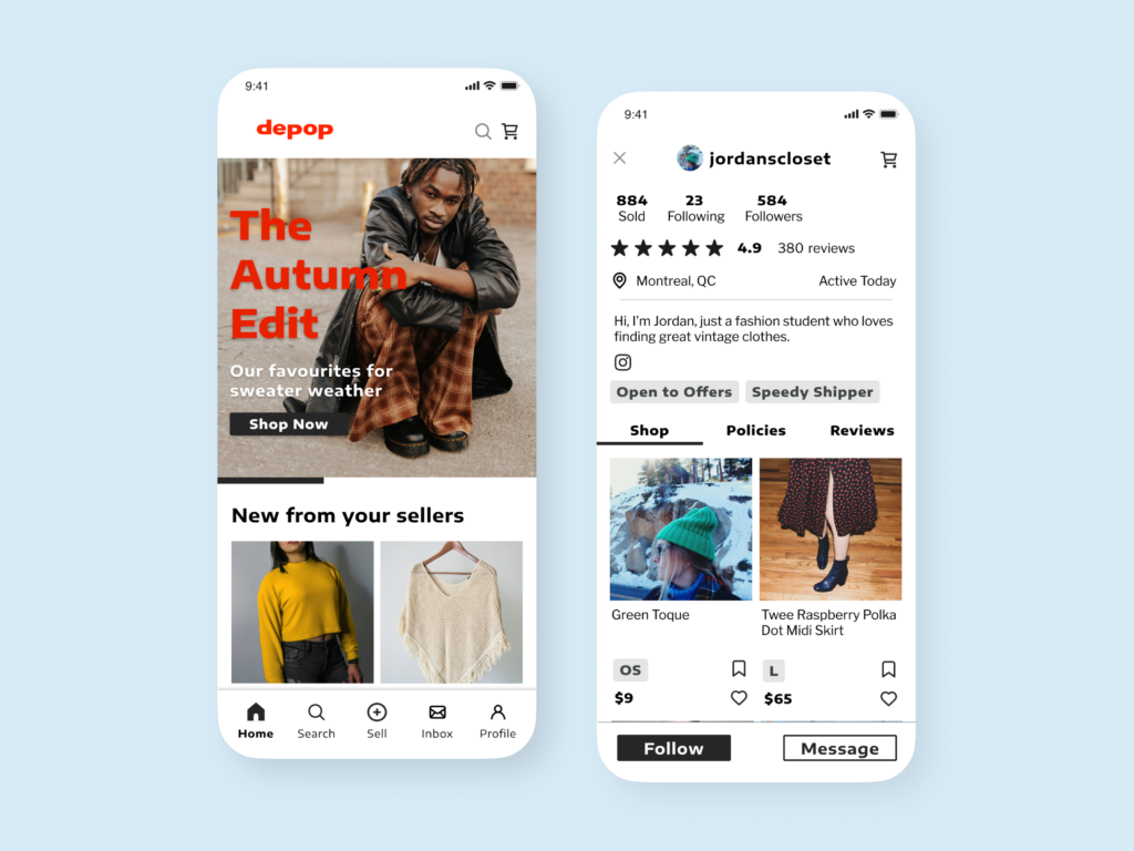
The updated home screen removes the infinite scroll from the original app and shifts focus to the accounts the user follows. I also added a feature section that highlights curated collections or sellers. This encourages sellers to create higher-quality content in hopes of being featured by Depop.
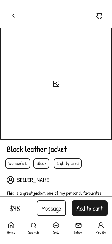
The product page is designed to be image-centric, with options to message the seller or add the item to the cart for a smoother shopping experience.
User Testing
To assess the usability of my low-fidelity prototype, I conducted tests with six participants—four in person and two virtually using UXtweak. Their feedback provided valuable insights:
Checking seller profiles: Four participants wanted to view the seller’s profile, emphasizing the need to establish trust and connection with sellers while building the app’s community feel.
Engaging home page: Four participants explored the home page before searching, indicating that the structured layout effectively captured their interest.
Desire for seller details: In post-test interviews, participants suggested adding seller information—such as ratings, shipping details, and store policies—on the product page.
Save feature request: One participant highlighted the need for a “save” option alongside the “like” feature for easier revisits.
Based on this feedback, I prioritized enhancing the profile page by improving the accessibility of shop policies and reviews and incorporating social media links.
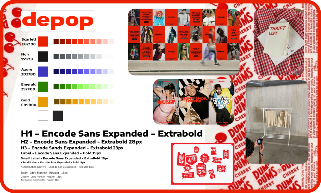
Visual Design and Components
I focused on preserving Depop’s minimalist, functional aesthetic while keeping the design content-driven, with an emphasis on user-uploaded photos. The typography stays true to the clean and bold sans-serif style of the original app, giving it a youthful and approachable look.
To give the prototype some oomph, I designed and animated key components, including an animated heart icon, a save icon, and an image carousel. I also created functional elements like the accordion menu for filtering, clickable chips, icons, a tab bar, an app bar, and a streamlined shop information bar.
Animated like and save buttons.
Accordion search filtering with functional chips.
Image carousel for feature section.
High Fidelity Prototype
Drawing from research, user testing, and the visual direction established in the style tile, I created a high-fidelity prototype that showcases the final user experience with a polished interface.
Reflections
Iterative design is key: By keeping the first prototype low-fidelity, I was able to do several iterations and rounds of user testing, which brought up issues I hadn’t thought of, particularly regarding building trust between buyers and sellers. With this feedback, I was able to refocus on enhancing the user profiles with the time I had remaining, which led to a stronger end product.
Adaptability: I worked within constraints like time limits and the absence of original assets. To overcome these challenges, I found creative solutions, such as substituting fonts and icons, to keep the design functional and cohesive.
Designing experiences for all users: One of the biggest takeaways was learning how different users experience the same platform. Buyers care about finding cool items easily from sellers that they trust, while sellers are concerned with their shop discoverability and managing communications with buyers. Balancing these perspectives was rewarding—I discovered that improvements for one group, like detailed profiles to build trust, often benefit the other, making it easier for sellers to share important details like returns and shipping. When both buyers and sellers have positive experiences, the platform thrives, leading to more sales and greater success for everyone involved.