Saje
Designing mindful and soothing interactions for a wellness-focused shopping app.
Project Overview
Challenge
Saje, a wellness brand known for its natural self-care products, needed a mobile e-commerce application that made shopping effortless while staying true to their calming and holistic brand identity. The app had to be visually cohesive with their existing aesthetic, support seamless product discovery, and allow for easy updates to highlight seasonal and promotional content. Additionally, the shopping experience needed to be intuitive, ensuring a secure and stress-free checkout process. Motion design played a key role in enhancing usability and reinforcing Saje’s sense of mindfulness—through subtle animations, smooth transitions, and thoughtful micro-interactions, I aimed to create a shopping flow that felt intuitive, immersive, and aligned with the brand’s soothing, wellness-focused philosophy.
Objective
- To design an intuitive e-commerce mobile app for Saje that enhances the shopping experience through thoughtful motion design.
Project Scope
Mobile app design
Tools
Figma
Role
UX Design, UI Design, Motion Design
Team
Self directed, with feedback from mentor and peers
Duration
6 weeks, 6 hours a week, 36 hours
Problem Statement
Saje’s e-commerce website provides a strong shopping experience, but a dedicated mobile app would better serve their most loyal customers by offering personalized recommendations, deeper engagement, and a more dynamic space for seasonal promotions—features that a website alone can’t fully optimize. The client needs:
- A product that is visually cohesive with existing Saje brand.
- To be able to easily update for seasonal promotions.
- An easy shopping experience for their customers.
- Secure checkout and payment.
User Persona
In order to make the design resonate with Saje’s customers, I created a user persona based on research into their primary audience: women in their 30’s who enjoy natural wellness products. This persona helped guide my design decisions by keeping the user’s goals, needs, and behaviours at the centre of the process.

Leah Chen
The Mindful Professional
Age: 35
Location: Vancouver, BC
Occupation: Marketing Manager at a tech start-up
Leah has been a loyal Saje customer for years. She leads a busy professional life and integrates mindfulness and natural wellness products into her daily routines. While she enjoys visiting Saje stores, she often shops online for convenience. Leah values brands that align with her beliefs in sustainability, ethical sourcing, and holistic self-care. She wants her shopping experience to be simple, relaxing, and tailored to her needs.
Goals
- Quickly reorder favourite products and discover new ones that fit her lifestyle.
- Access seasonal promotions and exclusive, member-only offers.
- Learn about wellness rituals that enhance her self-care practices.
Frustrations
- Mobile shopping that feels cluttered or time-consuming.
- Hard to find personalized product recommendations.
- Limited ways to save and organize her favourite products and routines.
By focusing on a customer who values wellness, simplicity, and mindful shopping, I was able to tailor the app experience to better meet their expectations.
User Task and Flows
The client provided the task flow in the project brief. They wanted new users to register an account, shop for a product, learn about the product and brand, and check out.

Based off of the provided task flow, I created a user flow, going into more detail about the onboarding, shopping, and checkout experiences.


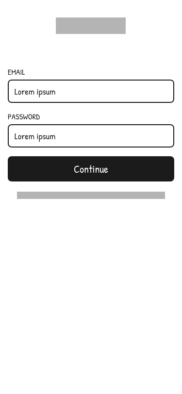
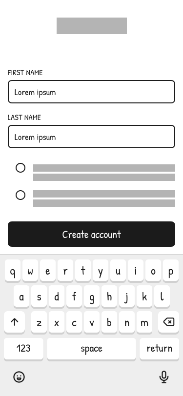
Low Fidelity Prototype
After defining user flows, I created low-fidelity prototypes to map key interactions and layout structures. This helped me refine navigation and decide on some patterns for the different sections of the site.
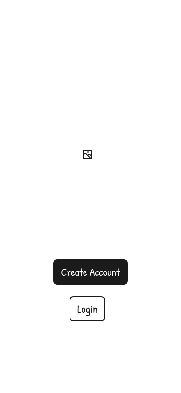

For the onboarding experience, I prioritized simplicity and ease of entry.
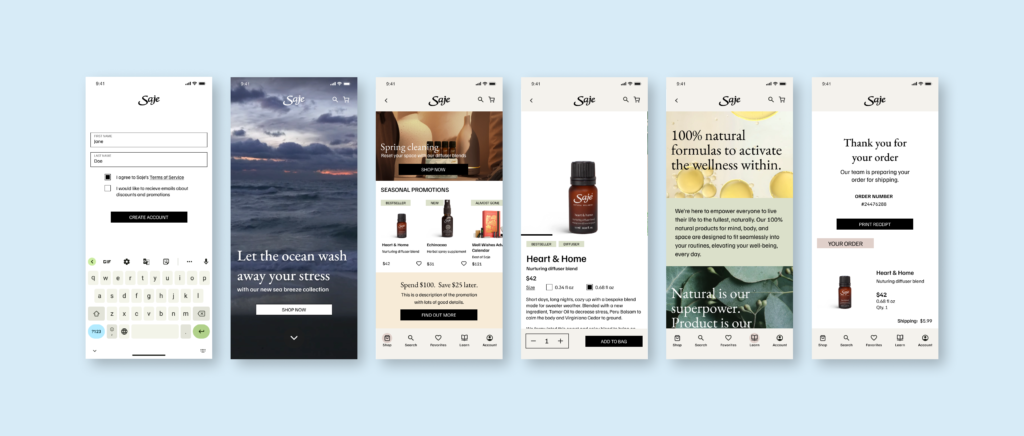
A two-step account creation process keeps friction low while still collecting essential information—email, password, name, and TOS agreement. The calming animation at the loading screen rewards the user’s efforts and creates anticipation for the shopping experience while reinforcing Saje’s brand identity.
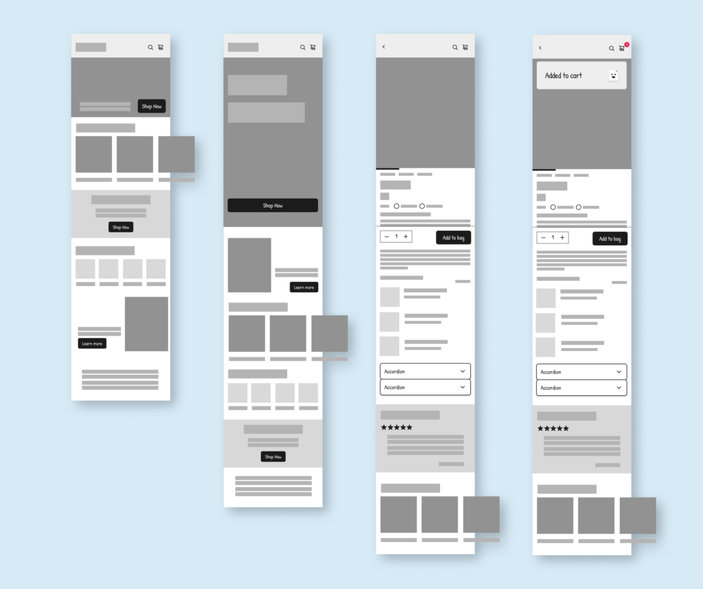
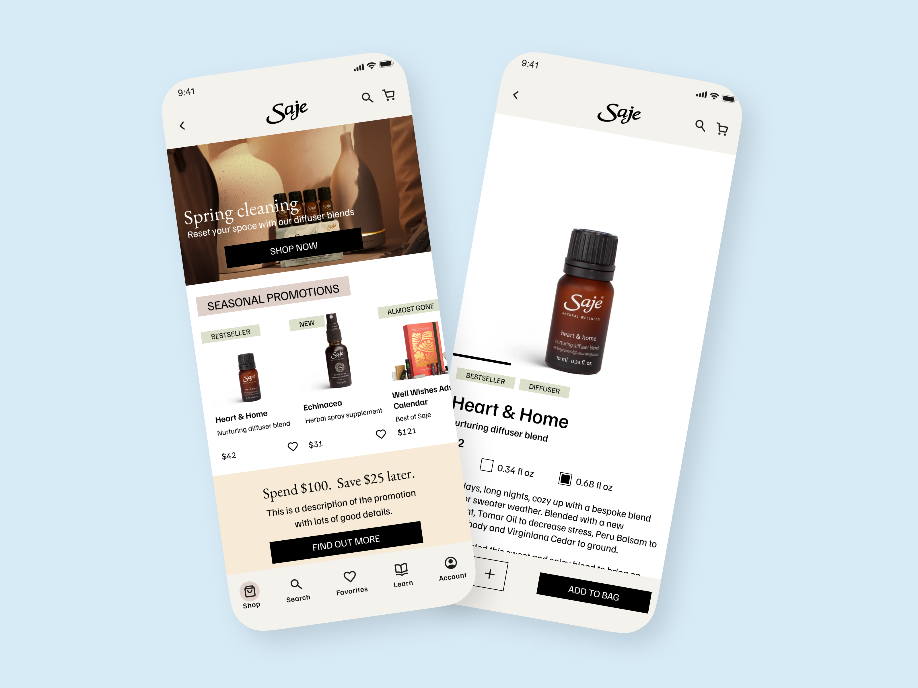
To ensure the app remains dynamic and easy to navigate, I designed flexible layouts that balance intuitive shopping with adaptable promotional content.
The home page layout features movable sections that allow for easy updates to seasonal promotions, while an alternate layout with a full-screen video creates immediate engagement for limited-time campaigns. The product page enhances the shopping experience with accordions that simplify information and reduce cognitive load, while a sticky ‘Add to Bag’ bar ensures a smooth purchasing flow. These design choices align with Saje’s goals of effortless updates and an intuitive shopping experience.
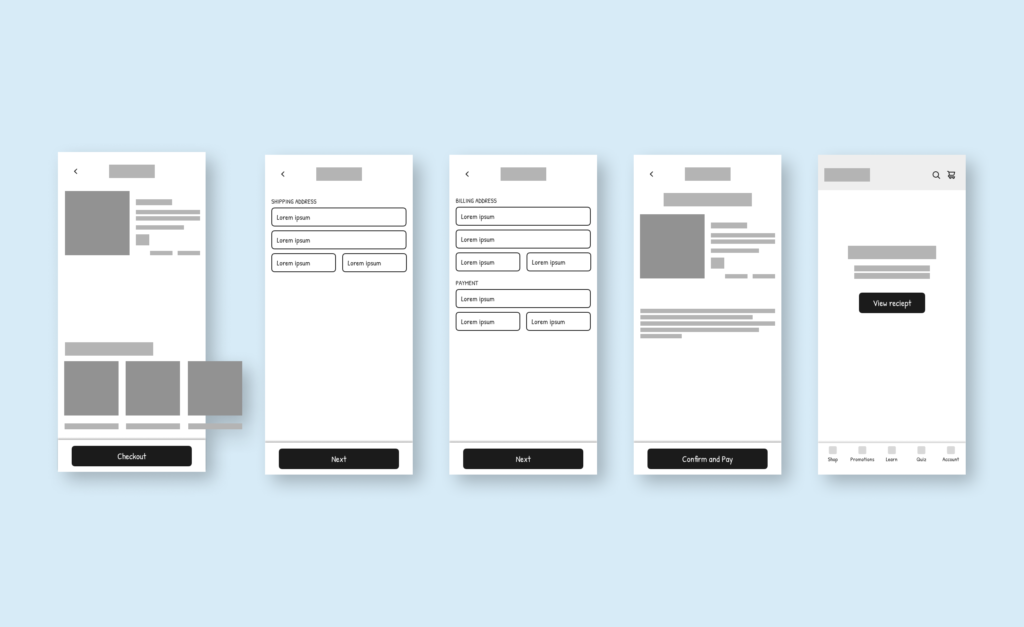
I designed the checkout flow to be clear and streamlined, breaking the process into manageable steps: cart review, address entry, payment details, confirmation, and receipt. By chunking information across these screens, I reduced cognitive load and gave the user a sense of progress throughout the checkout process.
Visual Design
I followed Saje’s existing visual design, opting for warm neutral palettes and featuring textures found in nature. The typography combines an old style serif font with a soft and modern sans serif, balancing elegance with approachability.

To enhance the experience, I incorporated calm fade and slide animations, gently guiding users through the app in a soothing way. Microinteractions, such as animations for the like icon and carousels, add a layer of responsiveness without overwhelming the user. Animations also serve as rewards for key actions like completing sign-up or checkout, while video features and loading screens create moments of anticipation and reinforce Saje’s immersive, wellness-focused atmosphere.
High fidelity prototype
Reflections
Balancing brand and usability: One of the key challenges was translating Saje’s well-established aesthetic into a shopping experience that felt as calm and welcoming as their physical stores. This meant finding the balance between beautiful visuals and a seamless user experience, ensuring that the design remained functional while staying true to their brand.
Designing for flexibility: Saje’s need for seasonal updates and promotions pushed me to design flexible templates and modular layouts. By creating reusable components, I made it easier for the client to update their app regularly without compromising the flow or visual consistency.
The role of motion and interaction: I learned how thoughtful motion design—like calm fades, slides, and microinteractions—can shape the overall user experience. Animations like the loading screen and video features helped create anticipation and reinforce calm and earthy atmosphere that Saje is known for.
The value of user testing: Feedback from mentors and peers was incredibly helpful, especially in refining details like the progress indicators in onboarding and checkout. However, I recognize the need for deeper testing with Saje’s actual customers. Direct input from their customers would have provided valuable insights and could have made the final design even more aligned with their shopping preferences and habits.